I went through our local home-a-rama with my boy this week and I wanted to share some of the amazing spaces with you here. First of all, can I just tell you how much I love doing this with my Bub? He loves looking through houses with me (to a point) and it makes me so happy. :)
There were only five houses on this tour so he totally hung in there and we had a blast “rating” the houses.
I’m going to break this up into a couple posts (see part 2 here!) because there are so many pics! This first house was my absolute favorite – it was SO well done, from the outside in:

This was the view when you stepped into the foyer:

And this was the view when you looked up:
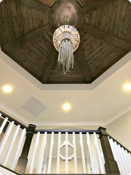
Stunning!
The office area was done in a black (or very dark gray) board and batten treatment:

Loved the trim – it was a slight twist on the regular board and batten look. And the wallpaper (that was everywhere in all the houses!) was SO pretty – metallic and modern.
There was another hallway out of the office that went to a butler’s pantry and the “mom’s corner”:

I’m developing a mild obsession with hallways. We don’t have any in our house and I love them. :)
The cabinetry was a beautiful dark gray. It reminded me of my Peppercorn bedroom wall:

Brass is coming back in a big way and the hardware on these cabinets was a lovely brushed brass – not bright and shiny. I loved it paired with the dark gray.
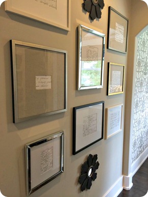
I thought this gallery wall was brilliant:
They blew up and framed handwritten recipes. So adorable. I LOVE this idea if you have old family recipes written by your mom or grandmother.
Every time we turned a corner in this house I swooned. This kitchen was just gorgeous:

I’m totally in to the two tone cabinets lately and these looked so classic and pretty to me. The gray was just on the taller cabinets to the side and the large island but it really gave some nice contrast. I find I’m liking this look better than an all white kitchen.
And yes, I loved the brass fixtures! :)
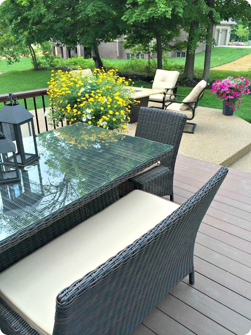
The table, chairs and bench were beautiful as well:

The family room was well done of course but I actually preferred the outdoor family room:
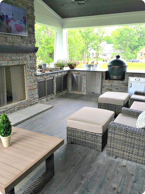
It was a lot of grey but very soothing and an AWESOME space. I’d have flowers everywhere though. :)
The basement was awesome too – I loved the idea of breaking up cigar boxes as a wall treatment:

How cool is that? The dedicated wine room isn’t too shabby either. I’d take it.
I loved the basement bathroom with the tile wall and round mirror too:
 If you have a small powder room this look would be fairly inexpensive and would make a huge impact!
I think my one of my favorite spots in the whole house was this incredible little landing when you walked upstairs:

The ceiling was amazing and those windows!! Positively dreamy.
Gorgeous right? It was a little more modern than what I would personally do but SO well done, top to bottom.
The second house wasn’t my favorite from the outside just because it was so much brown:

But the doors. The doors! I think every house had glass front doors. (Interesting that we were just talking about that again.):

This house was much more traditionally decorated and done beautifully:

I really liked the windows flanking the fireplace instead of built ins. And the ceiling was gorgeous:
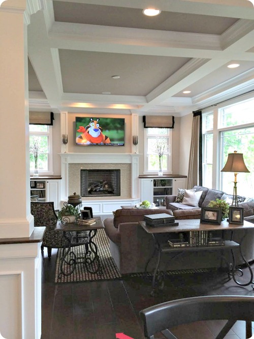
Loved the details on the living room windows too:

I’m a sucker for an awesome mud room and this one did not disappoint:
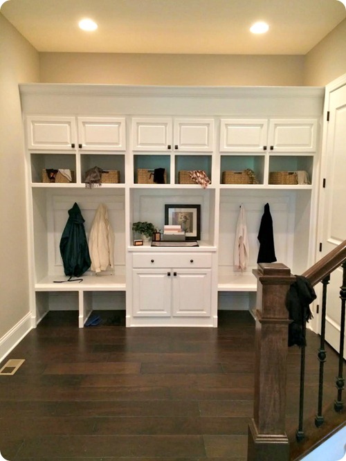
There was an incredible in-laws quarters that had a small family room, kitchen and bedroom:

You could totally rent that puppy out. You know, to help pay for the million dollar mortgage. ;)
The mom room upstairs (funny how they are usually paired with the laundry) was a great space with simple rods between the cabinets for wrapping paper:

I was surprised to see the laminate counters in there but also pleased – I think laminate can look quite nice!
The basement was awesome of course but this room was our favorite:

Which is interesting because it was probably the cheapest room in the entire house – it was just cement walls painted bright colors. The ceiling (and all the ductwork and pipes) were sprayed black and then there was carpet and baseboards – that was it as far as the finishing.
The backyard at this house was simple compared to the others but really well done and very pretty:
There you go! Two of the five homes – I’ll share the others soon. Did you have a favorite room? Do you love to walk through these tours too?
Hope you have a fantastic weekend my friends!
**House one was designed and built by G & G Custom Homes and decorated by Hilari Goris Designs. House two was designed and built by Bedrock Builders and decorated by DJ Interiors.

Post a Comment