Dun dun dunnnnn. That sounded a bit ominous right?
I shared a bit of of this space back when I showed you how to switch out your door knobs but other than that I don’t think it’s a room I’ve ever shown on the blog. Mainly because I’ve hardly touched it for years now.
But I’ve been planning some big changes to this space for the past year or so, so I figured it was time to share the current pics (and some of my plans!). I decorated this room about eight years ago now – I honestly can’t remember if I did this when I was pregnant with our boy or if I did it after, but either way it’s been awhile and it’s looked the same since.
My stepdaughter also used this space for a long time and our guests use it too – I’m sure they appreciate the little touches I added. ;) This is one of those spaces that is not at all what I would do now but I’m proud of it and it brings back really sweet memories. It was done early on, just a couple years after moving into our home and every bit of it was done with love. (All of the rooms in our house are but the kid’s spaces give my heart that extra tug.)
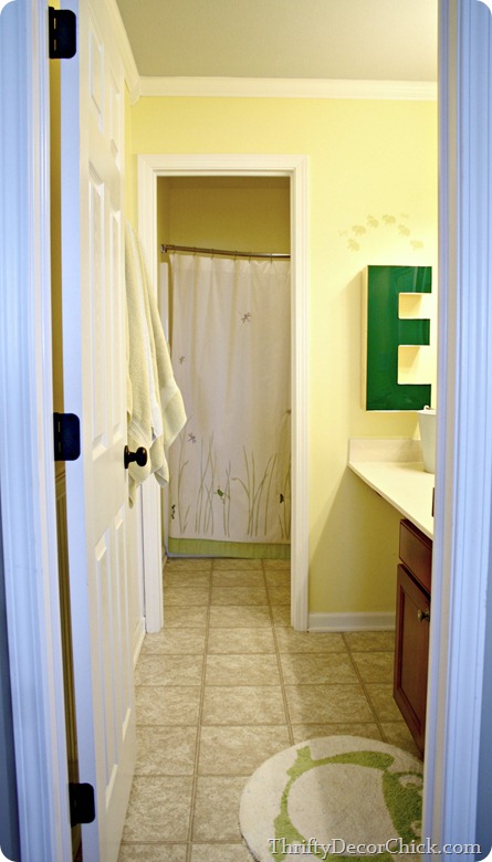
I painted the walls a pretty yellow and the ceiling the same blue as the Bub’s room:
Bear with me on the lighting in here – it’s pretty horrible and the yellow walls don’t help. More on that later. :)
I installed the crown molding – the “cheater” way I showed you here – and a wall of beadboard as well:

I framed out the mirror with wood trim and went a little stencil crazy:
For a long time there was a little Goodwill medicine cabinet where the “E” is now but I replaced it about a year ago. I think that’s the one update I’ve made in all these years.
I added little touches like a little DIY towel hook and some letters in the shower room with what are supposed to be bubbles on them but have always looked like paw prints:
But there’s a big issue with this bathroom that I thought I would love at first. The whole separation thing – one “room” with the vanity and one with the toilet and shower – has not worked out well.
In fact, it drives me a little crazy. :) This isn’t a small bathroom (not very wide but it is long) but it feels SO tight because it’s broken into two spaces. That back room with the shower is so dark and small, we pretty much hate being in there:
I thought the separated rooms was so unique when we built the house, but within months I was cursing it.
So…I have a plan. The easy stuff first! I want to do one of two things to the vanity area -- cut down the countertop and place a tall, painted hutch or something similar there for storage. Or extend the vanity and make it twice as big. As of a couple years ago our cabinet design was still being produced, so I could just add on to the ones that are there. We chose one sink when we built and only need one – but for resale (someday, long time from now) I think adding another one may be worth it. I just need to see how much of a pain that would be.
One thing I know – I’ve wanted to paint the cabinets a navy blue for some time now, and Megan’s vanity convinced me:
Jen’s navy blue looks great too, I’m pretty sure this is the direction I’ll go:
I also considered a kelly green, but I think the dark blue is calling my name. :)
I want the vinyl floors gone and right now I’m planning on the laundry room tile instead:
It was crazy affordable and I LOVE how it looks.
Of course the wall color will change, but I have no idea what it will be just yet.
But there’s a couple biggies I’d like to add too. One is a window above the shower. I know windows and showers don’t always mix, but I’m thinking a long, skinny one well above the shower, just to allow some natural light in this space. That back area especially is so dark and dreary. Are windows near showers asking for trouble?
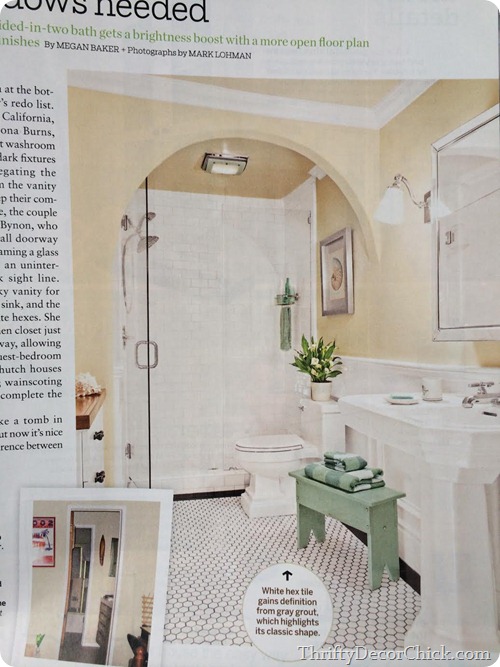
And THEN…about a year ago I saw this photo in This Old House and I haven’t gotten it out of my head since:
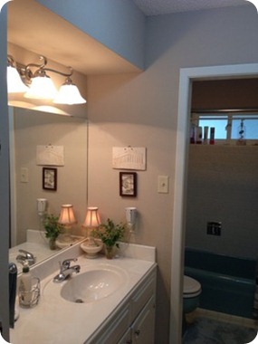
It’s hard to tell from the little before photo, but it was a similar set up as ours. This bathroom is much wider than ours, but the idea is the same. They took down the wall between the two rooms and opened it up – LOVE it. I like that this one shows the difference taking down that wall made without adding a window too – maybe we wouldn’t add one? (Adding a window is a big deal, at least it seems like it.)
And then I saw this bathroom at Houzz the other day and it made me even more determined to take down that wall:
I can’t even believe the difference it makes! That bath is a very similar size as ours and it looks twice as big without that wall.
I’ve ALWAYS wanted to knock down a wall in our house. I blame the DIY Network. This may be my chance to do just that! I’m giddy at the thought. :)
For the most part I’ve not focused on the rooms in our home that are supposed to bring more value – the kitchen and bathrooms. I’ve had big plans for our kitchen for awhile but I don’t know when it will happen, and our bathroom is totally functional so I’ve never made it a priority. And I know it will not be cheap! But I’m starting to get an itch to update these spaces – I think it must be the ten year itch. :)
Do you have a separated bathroom like ours? Do you love it or hate it? Any windows in the shower people who want to chime in?
P.S. The pin it button is now on all of my photos but I ask you visit the original source to pin from there.


Post a Comment